

In the 2008 film The Dark Knight, the film uses colour to symbolise the two lead characters; Batman and Joker.
Batman is associated with dark, cool shades (blue and grey) representing his composed, calculated and rational personality. Whilst the Joker is associated with vibrant colours (like purple and red), reflecting his chaotic, unpredictable nature.
Colour theory is the foundation of understanding how colours work together and how they affect our emotions and perceptions. These foundations have guided the effective use of colours across literature, films, art, design and history.
It was during the 19th century that Wilhelm Wundt developed the system of colour symbolism that is still used today by psychologists, designers, and marketers. He was the first to argue that colours could have a significant impact on our emotions and behaviour. But other colour theories had started as far back as the 5th century BCE, in Ancient Greece.
Understanding colour psychology in branding
The psychology of colour theory can play a crucial role in company branding. It goes beyond further than aesthetics, tapping into the psychology to evoke emotions, establish brand identity, and influence your target audience decisions.
Emotional Connection: Colours can associate and resonate with human emotions. For instance, red sparks energy, excitement, and passion, while green evokes new beginnings and growth. By understanding these associations, companies can apply brand strategy using colour to evoke the emotions they aim to bring out from consumers.
Brand Identity: Colour forms a core part of a brand’s identity, being different from competitors and setting its recognition among consumers. A consistent use of brand colours across various touchpoints, such as logos, packaging, websites, and marketing materials, reinforces brand recognition and establishes a unified brand experience.
Target Audience: Colours can be carefully selected to resonate with specific target audiences based on their demographics and interests. For example, a brand targeting young children might employ bright, playful colours, while a brand seeking to appeal to a sophisticated older consumer might opt for more elegant shades.
Messaging: Colours can subtly convey brand messages and values. A technology brand might incorporate vibrant, futuristic hues, while a brand focusing on wellness might use greens and blues, tied to nature. Colours can effectively complement verbal communication and reinforce the brand’s underlying message.
Cultural Sensitivity: While colour associations can transcend cultures, it’s crucial to consider cultural nuances when selecting brand colours. In some cultures, certain colours may hold specific meanings or evoke negative connotations.
How have other companies used colour?
Apple use the colours black and white, conveying sophistication, luxury, and simplicity. This perfectly aligns with Apple’s brand image as a premium technology company.
Nickelodeon uses the colour orange. Aimed at children and evokes playfulness, excitement and entertainment. Nickelodeon started as a children’s cable channel, but has since branched out to popular games, movies, hotels and theme parks.
Ford use blue. Evoking trust, dependability, and commitment. When purchasing a car, we want to make sure we are in safe hands, the colour blue is associated with calmness.
Recent Posts
Proteus awarded FSQS certification again – what it means for you

Trusted Script Enforcement in SharePoint Online: What’s Changing and How to Prepare with SPFx

Mastering AI Prompts: Unlock Smarter Business Results

Rebrand vs Brand Refresh

The Complete Guide to SharePoint Branding for UK Enterprises

Why Images Matter in Viva Engage
Some examples in our work:

LPG (Legal Protection Group): Purple, the colour resonates with the colour of the robes worn by judges of common courts. Purple also represents harmony, power, and stability.
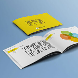
Good Energy: Yellow, conveying happiness, enthusiasm, confidence, and originality. The yellow circle in the logo represents sunshine – one of the renewable energy sources.

Foresters Friendly Society: Teal, representing open communication, practical thinking, and clarity. All positive symbolism to reinforce an identity for a financial brand.
So does colour control ALL POWER in branding?
In short NO. Understanding colour psychology is important when creating a brand and does evoke emotions, brand associations, cultural beliefs and messaging, but colour is only ONE part of a great brand campaign.
How can we help?
Here at Proteus we like to make things happen. We use three steps to create a successful brand: strategy, design and digital. We work to gain a deep understanding of our clients and their business challenges, using strategy to research and establish the characteristics behind their brand and their core beliefs to create concepts which is represented through design with colour, shapes, typography, copy and other mediums. Last, but not least we then apply these results to the digital world, showcasing on websites, video and animation. By using our three way strategy our brands can create a lasting impact and forge a deep connection with consumers.
If you’d like our help in making things happen for your business, please get in touch:
Email: tellmemore@proteus-uk.com
Telephone: 0117 985 8888
Need help being different?
Here at Proteus we like to make things happen. We use three steps to create a successful brand and blueprint:
- Gather insight
- Picture the future
- Find the difference.
Proteus work with you to understand your objectives, develop a clear proposition that differentiates you from your competitors and then plan, create and seamlessly deliver your communications. We do this by challenging preconceptions, and simplifying the complex while understanding how the latest technology and consumer behaviour trends impact your customers, and how they interact with your brand.